Process
Apple was arriving in Vietnam for the first time, online. No physical store, no flagship moment, just a website opening its doors. The work had to make that arrival feel like a meaningful greeting, not a soft launch.
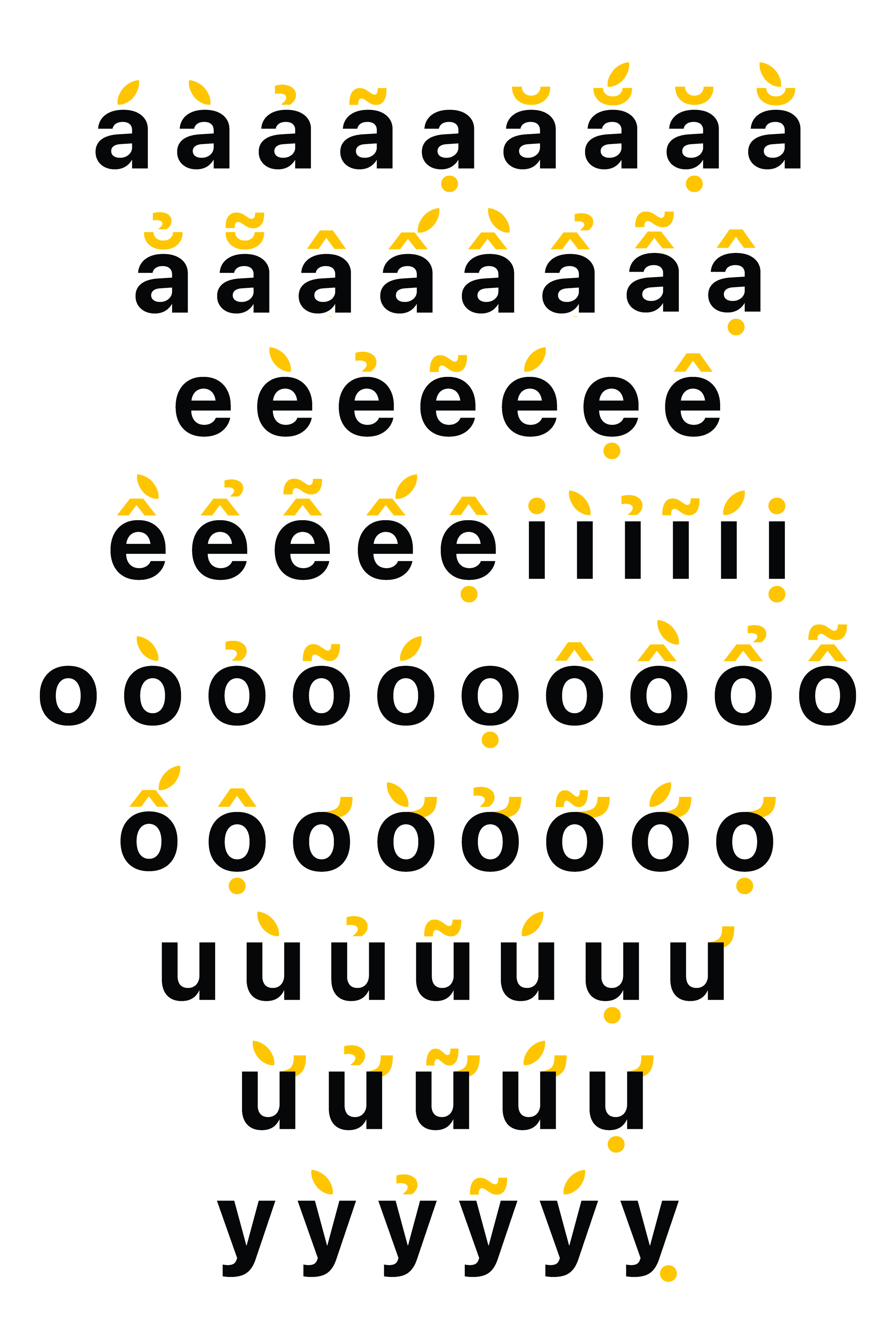
The idea came from looking at the language itself. Vietnamese is built on diacritics, the tone marks that sit above and below letters to shape meaning. They've been part of the written language for over 200 years. They're also, visually, small angled shapes. One of them, the slanting acute mark, looks remarkably like the leaf on the Apple logo.
That became the move. Across the entire identity, every slanting tone mark in Vietnamese type was replaced with the Apple leaf. A small, specific substitution that meant Apple wasn't appearing alongside the Vietnamese language. It was appearing inside it.
The system extended from there. All diacritics rendered in yellow, set against black type, picking up Vietnam's national colours without leaning on flags or symbols. Typography did the heavy lifting throughout: hero compositions, social posts, the apple.com/vn landing, all of it letterform-led, with the diacritics carrying the colour and the brand.
To say hello properly, a hero video greeted Vietnam through its own pronouns. Vietnamese has dozens of ways to address a person, ordered by age, relationship, and respect. The video moved through them in order, a friend, a neighbour, an acquaintance, a brother, a sister, parents, elders, and landed on Xin Chào Việt Nam. A greeting that earned its arrival by knowing who it was speaking to.
Animated stickers extended the same warmth into everyday conversation. Different ways Vietnamese people greet each other across regions, Alô, Chào, Gì?, Eee, Ơi, Hê lô, each animated, each leaning into the playfulness of dialect. Hello, but in the voice of a country, not a brand.